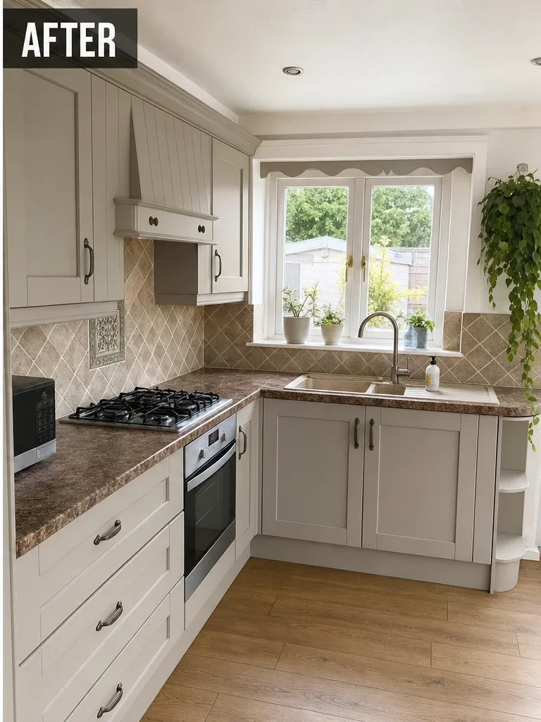
Colour Guide

Popular sprayed kitchen colours, and how they actually behave

Choosing a kitchen colour from a screen is guesswork. This is what people genuinely ask for, how each family behaves in a real kitchen, and which ones still look right in five years.

Any RAL or BS colour
Farrow & Ball equivalents
Satin, matt or gloss
5-year kitchen guarantee

Screens lie about colour, and greys lie most

Every kitchen colour decision people regret was made on a screen. Monitor brightness, colour temperature, the photograph's own white balance and your kitchen's lighting all shift how a shade reads, and greys and greens shift more than anything else. A grey that looks warm and soft on a phone can read cold and blue on a north-facing wall.

So treat everything below, and every image on this site, as a starting point for a conversation rather than a colour match. The purpose of this page is to narrow six families down to one or two, not to pick a final shade.

The final shade gets confirmed properly. Once your booking deposit is received you can ask for one sprayed sample panel in your chosen colour and finish, where practical for the job, so you are approving the actual coating in your own light. Additional colours or extra samples may be chargeable, and you will be told the cost before anything is sprayed.

What people actually choose

Hex values shown are indicative only. They are here to distinguish one family from another, not to represent a coating.

Warm greys #CBD0CC · RAL 7035 light grey and similar

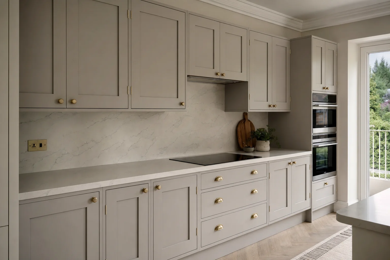
Warm greys

The most requested family by a distance, and the safest replacement for a dated cream or oak kitchen. A warm grey works with both cool quartz and warm oak worktops, which is precisely why it is so hard to get wrong. Where people go wrong is choosing a cool blue-grey against a warm worktop, which makes the worktop look yellow.
Sage and muted greens #7C8C74 · muted greens in the RAL 6000 family

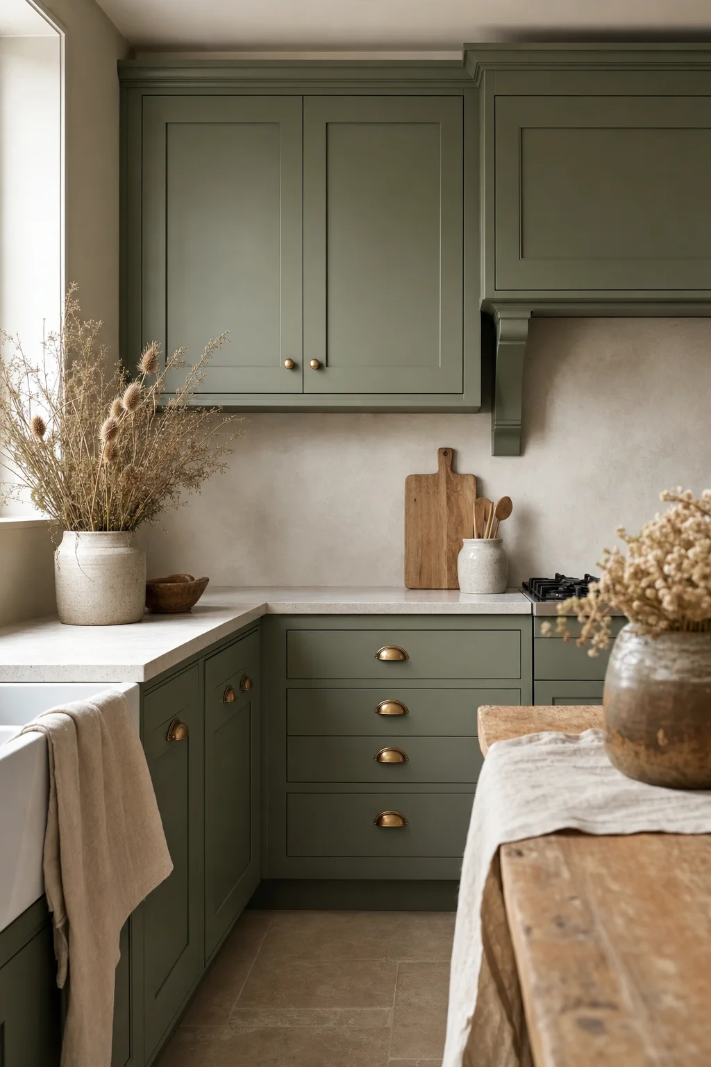
Sage and muted greens

The colour that has taken over from grey as the considered choice. Sage reads as deliberate rather than trend-driven, and it pairs particularly well with oak, brass hardware and white worktops. It is a strong choice for a kitchen with reasonable natural light and less so for a small north-facing room.

Off-whites and soft neutrals #F0EDE4 · RAL 9010 pure white and warmer off-whites

Off-whites and soft neutrals

Not everyone wants a colour. A clean off-white sprayed properly is a very different thing from the yellowed cream it replaces, and it makes a small kitchen feel larger. Worth knowing that a true brilliant white can look clinical against warm flooring, so a softer off-white is usually the better call.

Deep navy and inky blues #232C3F · RAL 5011 steel blue and similar

Deep navy and inky blues

Almost always used on base units with something lighter above, because a full kitchen in navy needs a lot of light to carry it. As a lower-half colour it is excellent: it hides the scuffs that base units inevitably get, and it looks expensive against brass or matt black hardware.

Charcoal and near-black #3A3D42 · dark greys in the RAL 7000 series

Charcoal and near-black

Dramatic and increasingly popular on islands and tall units. Shows dust and fingerprints more than any other choice, which is a genuine consideration around handles in a family kitchen. Satin helps considerably here compared with matt.

Two-tone combinations #8A8F86 · any two of the above

Two-tone combinations

Darker bases with lighter wall units is a well-established look that makes a kitchen feel taller and hides wear where it happens. It adds no material cost but it does add masking and separate spray sessions, so it needs raising at quoting stage rather than after.

How these families read on cupboard doors

Colour and finish references, used to show how a shade behaves on a kitchen surface. Not photographs of ProFinish customer kitchens.

Kitchen cupboards in pebble grey satin, colour reference
Example finish / colour inspiration, not a ProFinish customer project. A warm pebble grey satin. The safest replacement for a dated cream or oak kitchen.
Kitchen cupboards in sage green satin, colour reference
Example finish / colour inspiration, not a ProFinish customer project. Sage green satin. Reads as considered rather than trend-led, and works with oak and brass.
Kitchen cupboards in a pale satin finish, colour reference
Example finish / colour inspiration, not a ProFinish customer project. A pale satin finish on cupboard doors, showing the even sheen spraying achieves across a run.

The images above are colour and finish references used to show how a shade reads on a surface. They are not photographs of ProFinish customer projects. Genuine ProFinish work is published in Our Work as each job is completed and the customer is happy for it to be shown.

Six things that decide whether a colour works

Colour choice is mostly about context. These are the factors that matter more than the shade itself.

Your worktop is the fixed point

The worktop is not changing, so it dictates the palette. Warm worktops want warm greys and greens. Cool quartz and grey granite take cooler shades. A cool grey against a warm worktop is the most common mistake.

Which way the room faces

North-facing kitchens get cool, flat light all day, which pushes greys colder and makes dark colours feel heavy. South-facing rooms carry darker and stronger shades far more easily.

Flooring matters more than people expect

Wood-effect and warm tile flooring fight cool greys. This is usually the reason a colour that looked right in the sample looks wrong across the whole room.

Hardware changes the whole read

Brass and matt black hardware transform how a colour presents. If you are changing handles, decide that alongside the colour rather than afterwards, and fit them while the doors are off.

Where the wear will happen

Base units and the areas around handles take the abuse. Darker bases hide it. Very dark charcoal shows fingerprints. Both are valid choices as long as you know which trade-off you are making.

Two-tone lowers the risk

Putting the braver colour on base units or an island and keeping wall units light gives you the character without committing the whole room. It is why two-tone has stayed popular rather than passing as a trend.

Colour, coating and cost

Colour rangeVirtually any RAL or BS colour, plus Farrow & Ball and Little Greene equivalents. Colours can be matched from an existing paint or a physical sample.
Recommended sheenSatin for most kitchens. Matt for a contemporary look, accepting it shows finger grease around handles. Gloss needs a flawless substrate.
Coating systemA compatible preparation, primer and topcoat specification, with proper cure time between every stage.
Surfaces coveredDoors, drawer fronts, frames, edges, end panels, plinths and cornice on a full kitchen. Cupboard interiors are not normally sprayed.
CostDoors and drawer fronts only from £895. Full kitchen from £1,995. Medium kitchens typically £2,395 to £2,695. Large or high-detail typically £2,995 to £3,995 and up, quoted individually.
Two-toneNo additional material cost, but additional masking and separate spray sessions. Raise it at quoting stage so it is priced properly.
Time on siteDuration and restricted kitchen access are agreed before booking. Return to use follows the coating and site requirements.
GuaranteeWritten five-year finish guarantee on kitchens.

Confirm your chosen colour with a professionally sprayed sample before the main work begins

Once your booking deposit is received, you can ask for one sprayed sample panel in your chosen colour and finish, so you are approving the actual coating in your own light rather than a swatch on a screen. Available where practical for the job. Additional colours or extra samples may be chargeable, and Jay will tell you the cost before anything is sprayed.

Ask About a Sample

Straight answer on whether a sample makes sense for your job.

Straight answers

Thinking about transforming yours?

Send a wide photo of your kitchen, a shot of the worktop and flooring together, and a close-up of a door edge. The worktop and flooring are what actually narrow the colour choice, and the door edge tells you whether spraying is right for the kitchen at all.